This test post was generated using the block theme Emptytheme in WordPress 6.1.1.
Small H2 Heading
Medium H2 Heading
Large H2 Heading
Extra Large H2 Heading
Small paragraph
Medium paragraph
Large paragraph
Extra Large paragraph
theme.json contentSize = 620px
theme.json wideSize = 1000px
This test post was generated using the block theme Emptytheme in WordPress 6.1.1.
Small paragraph
Medium paragraph
Large paragraph
Extra Large paragraph
This test post was generated using the block theme Emptytheme in WordPress 6.1.1.
On this page, some group blocks have border or background color set to increase visibility.
This group has a no background color and no additional spacing set.
This group has a background color but no additional spacing set.
This group has a 1px border and padding preset 1
This group has padding preset 1
This group has a 1px border and padding preset 2
This group has a background color and padding preset 3
This group has a background color and padding preset 4
This group has a background color and padding preset 5
This group has a background color and padding preset 6
This group has a background color and padding preset 7
This group has padding preset 7
This group has a background color and margin preset 1
This group has a background color and margin preset 2
This group has a background color and margin preset 3
This group has a background color and margin preset 4
This group has a background color and margin preset 5
This group has a background color and margin preset 6
This group has a background color and margin preset 7
This group has a 1px border, padding preset 4 and margin preset 4
This group has padding preset 4 and margin preset 4
This test post was generated using the block theme Emptytheme in WordPress 6.1.1.
Navigation block with page list:
Site logo:
Site title:
Tagline block:
Query loop “Title & Date” variation:
Query loop “Title & Excerpt” variation:
This is a sticky post. There are a few things to verify: The sticky post should be distinctly recognizable in some way in comparison to normal posts. You can style the .sticky class if you are using the post_class() function to generate your post classes, which is a best practice. They should show at the…
Title should not overflow the content area A few things to check for: Non-breaking text in the title, content, and comments should have no adverse effects on layout or functionality. Check the browser window / tab title. If you are a plugin or widget developer, check that this text does not break anything. The following…
This post has no title, but it still must link to the single post view somehow. This is typically done by placing the permalink on the post date.
Query loop “Title, Date & Excerpt” variation:
This is a sticky post. There are a few things to verify: The sticky post should be distinctly recognizable in some way in comparison to normal posts. You can style the .sticky class if you are using the post_class() function to generate your post classes, which is a best practice. They should show at the…
Learn more about WordPress Embeds.
“I never tried to prove nothing, just wanted to give a good show. My life has always been my music, it’s always come first, but the music ain’t worth nothing if you can’t lay it on the public. The main thing is to live for that audience, ’cause what you’re there for is to please…
WordPress, how do I love thee? Let me count the ways (in 140 characters or less).
Query loop “Image, Date & Title” variation:
Avatar block:
Post title block:
Post excerpt:
This test post was generated using the block theme Emptytheme in WordPress 6.1.1. Navigation block with page list: Site logo: Site title: Tagline block: Query loop “Title & Date” variation: Query loop “Title & Excerpt” variation: Query loop “Title, Date & Excerpt” variation: Query loop “Image, Date & Title” variation: Avatar block: Post title block:…
Post featured image:

Post author:
Post date:
Categories:
Tags:
Next post & previous post:
Read More:
Read more: WP 6.1 Theme block categoryComments block:
Login/out:
Items in the block category have been created with the block editor.
Author biography block:
Term description, archive title, search results title can not be shown on single posts.
This test post was generated using the block theme Emptytheme in WordPress 6.1.1.
One single column inside a columns block.
Column one. The background color is on the single column.
Column two
Column one. The background color is on the parent columns block.
Column two
Column three
Group with paragraph inside. Below are the group block variations:
Row
Row
Stack
Stack
More block:
(more…)This test post was generated using the block theme Emptytheme in WordPress 6.1.1.
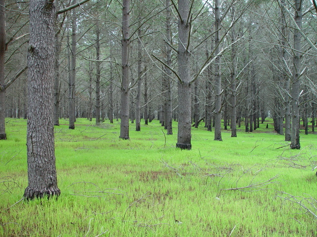
Image block:
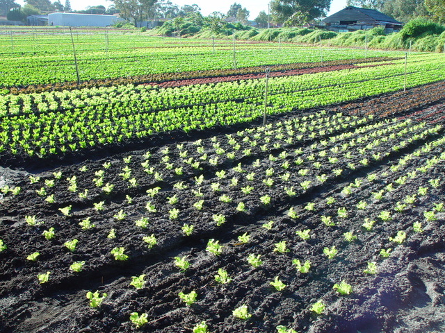
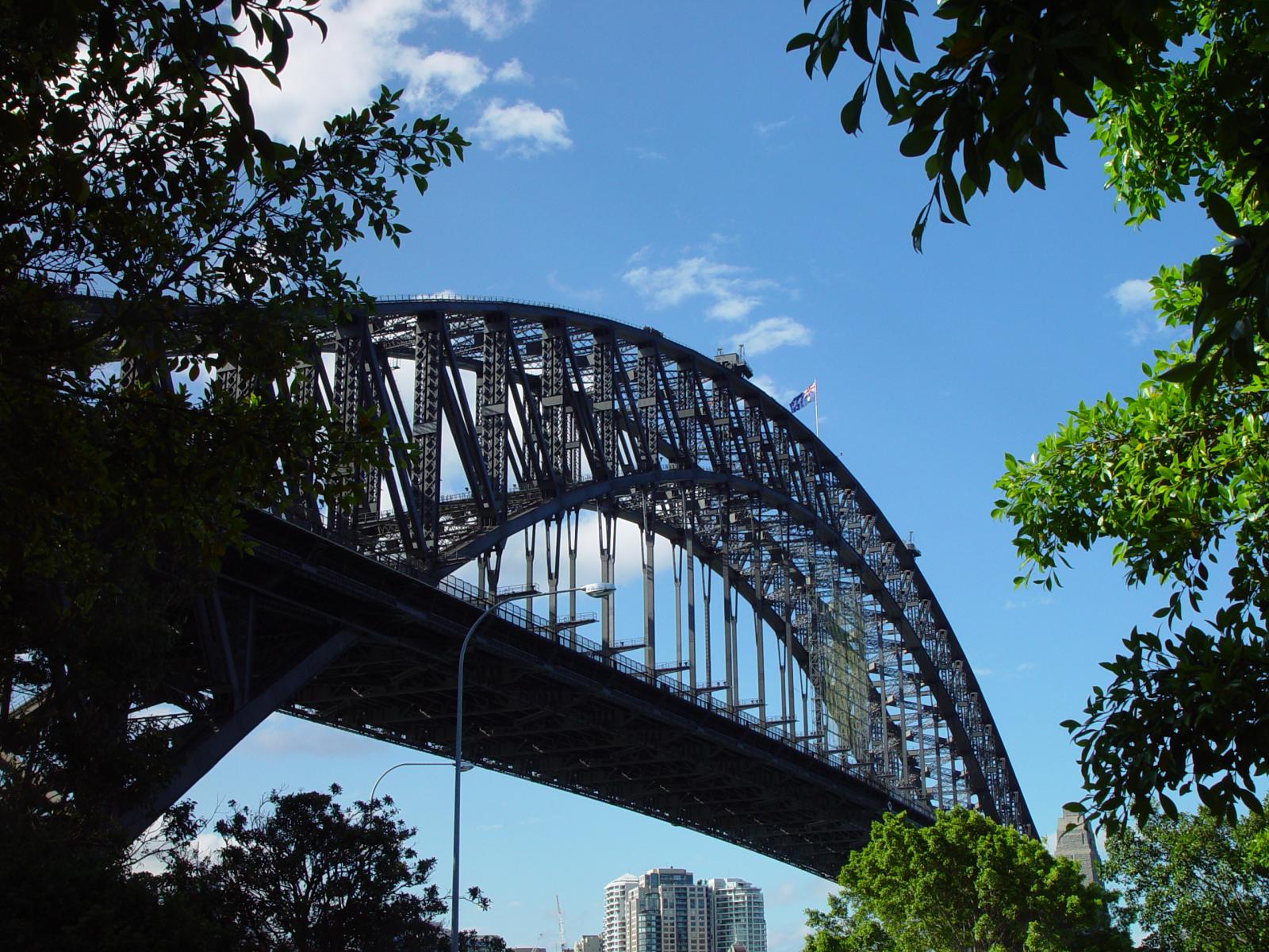
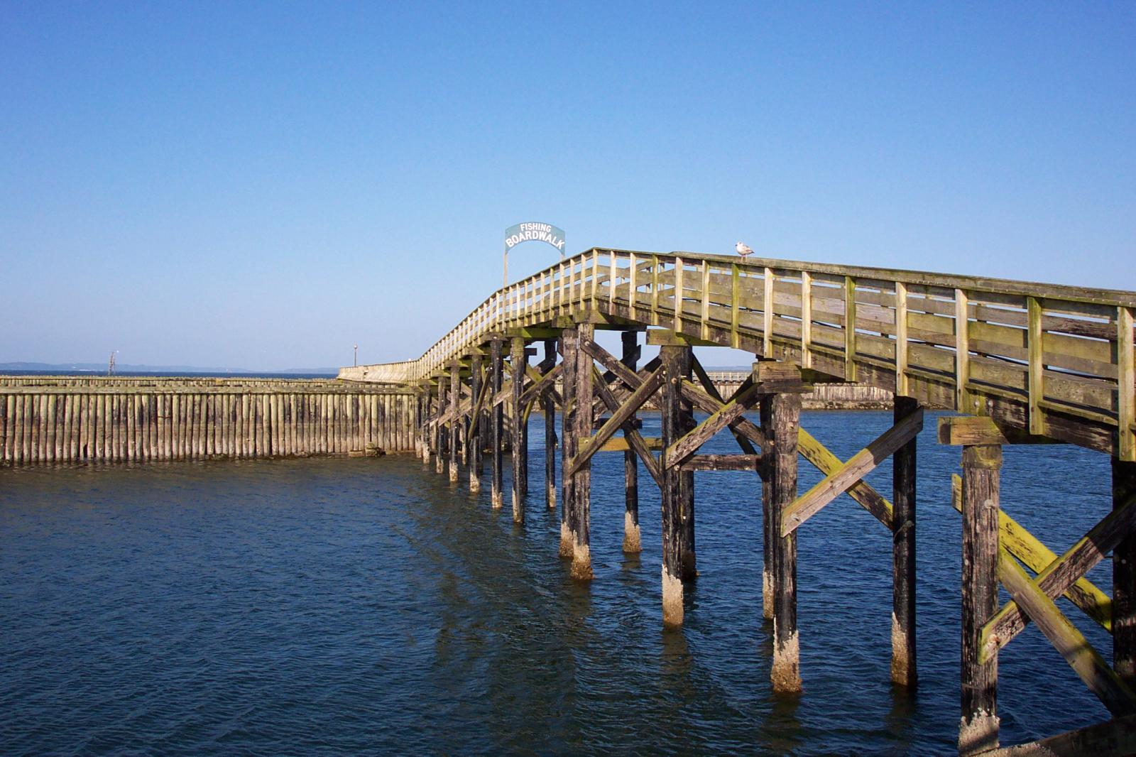
Gallery:


Audio:
Cover:

Write title…
Fixed background
Repeated background
Fixed and Repeated background

Duotone

Top left

Top center

Top right

Center left

Center right

Bottom left

Bottom center

Bottom right

This is the Media & Text block with an image on the left.
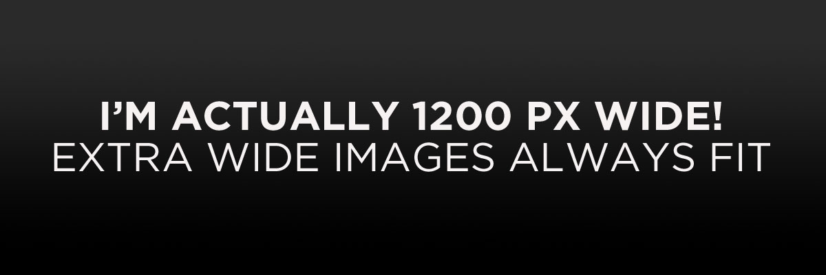
This is the Media & Text block with a cropped image on the left
This is the Media & Text block with a video the right.
This test post was generated using the block theme Emptytheme in WordPress 6.1.1.
Paragraph
Quote block
citation
classic block
code blockPreformatted block
Pull quote
Citation
| table cell | table cell two |
| table cell three | table cell four |
| header label one | header label two |
|---|---|
| table cell | table cell two |
| table cell three | table cell four |
| footer label one | footer label two |
Verse block
Welcome to image alignment! If you recognize this post, it is because these are blocks that have been converted from the classic Markup: Image Alignment post. The best way to demonstrate the ebb and flow of the various image positioning options is to nestle them snuggly among an ocean of words. Grab a paddle and let’s get started. Be sure to try it in RTL mode. Left should stay left and right should stay right for both reading directions.
On the topic of alignment, it should be noted that users can choose from the options of None, Left, Right, and Center. If the theme has added support for align wide, images can also be wide and full width. Be sure to test this page in RTL mode.
In addition, they also get the options of the image dimensions 25%, 50%, 75%, 100% or a set width and height.

The image above happens to be centered.
The rest of this paragraph is filler for the sake of seeing the text wrap around the 150×150 image, which is left aligned.
As you can see the should be some space above, below, and to the right of the image. The text should not be creeping on the image. Creeping is just not right. Images need breathing room too. Let them speak like you words. Let them do their jobs without any hassle from the text. In about one more sentence here, we’ll see that the text moves from the right of the image down below the image in seamless transition. Again, letting the do it’s thang. Mission accomplished!
And now for a massively large image. It also has no alignment.

The image above, though 1200px wide, should not overflow the content area. It should remain contained with no visible disruption to the flow of content.
And now we’re going to shift things to the right align. Again, there should be plenty of room above, below, and to the left of the image. Just look at him there… Hey guy! Way to rock that right side. I don’t care what the left aligned image says, you look great. Don’t let anyone else tell you differently.
In just a bit here, you should see the text start to wrap below the right aligned image and settle in nicely. There should still be plenty of room and everything should be sitting pretty. Yeah… Just like that. It never felt so good to be right.
And just when you thought we were done, we’re going to do them all over again with captions!

The image above happens to be centered. The caption also has a link in it, just to see if it does anything funky.

The rest of this paragraph is filler for the sake of seeing the text wrap around the 150×150 image, which is left aligned.
As you can see the should be some space above, below, and to the right of the image. The text should not be creeping on the image. Creeping is just not right. Images need breathing room too. Let them speak like you words. Let them do their jobs without any hassle from the text. In about one more sentence here, we’ll see that the text moves from the right of the image down below the image in seamless transition. Again, letting the do it’s thang. Mission accomplished!
And now for a massively large image. It also has no alignment.

The image above, though 1200px wide, should not overflow the content area. It should remain contained with no visible disruption to the flow of content.

And now we’re going to shift things to the right align. Again, there should be plenty of room above, below, and to the left of the image. Just look at him there… Hey guy! Way to rock that right side. I don’t care what the left aligned image says, you look great. Don’t let anyone else tell you differently.
In just a bit here, you should see the text start to wrap below the right aligned image and settle in nicely. There should still be plenty of room and everything should be sitting pretty. Yeah… Just like that. It never felt so good to be right.
Imagine that we would find a use for the extra wide image! This image has the wide width alignment:

Can we go bigger? This image has the full width alignment:

And that’s a wrap, yo! You survived the tumultuous waters of alignment. Image alignment achievement unlocked! One last thing: The last item in this post’s content is a thumbnail floated right. Make sure any elements after the content are clearing properly.
Button blocks are not semantically buttons, but links inside a styled div.
If you do not add a link, a link tag without an anchor will be used.
Check to make sure that the text wraps correctly when the button has more than one line of text, and when it is extra long.
Buttons have three styles:
If the theme has a custom color palette, test that background color and text color settings work correctly.
Now lets test how buttons display together with large texts.
Lorem ipsum dolor sit amet, consectetuer adipiscing elit. Donec mollis. Quisque convallis libero in sapien pharetra tincidunt. Aliquam elit ante, malesuada id, tempor eu, gravida id, odio.
Maecenas suscipit, risus et eleifend imperdiet, nisi orci ullamcorper massa, et adipiscing orci velit quis magna. Praesent sit amet ligula id orci venenatis auctor. Phasellus porttitor, metus non tincidunt dapibus, orci pede pretium neque, sit amet adipiscing ipsum lectus et libero. Aenean bibendum. Curabitur mattis quam id urna.
Vivamus dui. Donec nonummy lacinia lorem. Cras risus arcu, sodales ac, ultrices ac, mollis quis, justo. Sed a libero. Quisque risus erat, posuere at, tristique non, lacinia quis, eros.
This is a left aligned cover block with a background image.
The cover block lets you add text on top of images or videos.
This blocktype has several alignment options, and you can also align or center the text inside the block.
The background image can be fixed and you can change its opacity and add an overlay color.
Make sure that the text wraps correctly over the image, and that text markup and alignments are working.
The next image should have a pink overlay color, the text should be bold and aligned to the left:
A center aligned cover image block, with a left aligned text.
This is a full width cover block with a fixed background image with a 20% opacity.
Make sure that all the text is readable.
Our last cover image block has a wide width.
This is a wide cover block with a video background.
Compare the video and image blocks.
This block is centered.
The block below has no alignment, and the text is a link. Overlay colors must also work with video backgrounds.
One response to “WP 6.1 Theme block category”
This test post needs a comment.
Post comments form block: